
The Sad Cookie
Stakeholder: The Sad Cookie
Tools: Adobe Illustrator
Logo Usage: Instagram
For this project, the client, a home baker and food lover, is interested in starting a side business of selling his baked goods. His currently business and requests are all through Instagram so he is in need of a logo to make it more official.
The client wants his logo to be a sad, cute, and dopey looking cookie.
To the right is the final logo that the client is happy with!
DESIGN PROCESS
SKETCHES
To begin brainstorming, I sketched out different variations of a “sad cookie” to get an idea of what the client is looking for in terms of the cookie’s facial expression of “sadness” and body language (if any). I also want to explore different ways of including the text that makes it fun. Since this will primarily be used on Instagram as a profile photo, I wanted to make it circular, as it also complements the shape of the cookie.
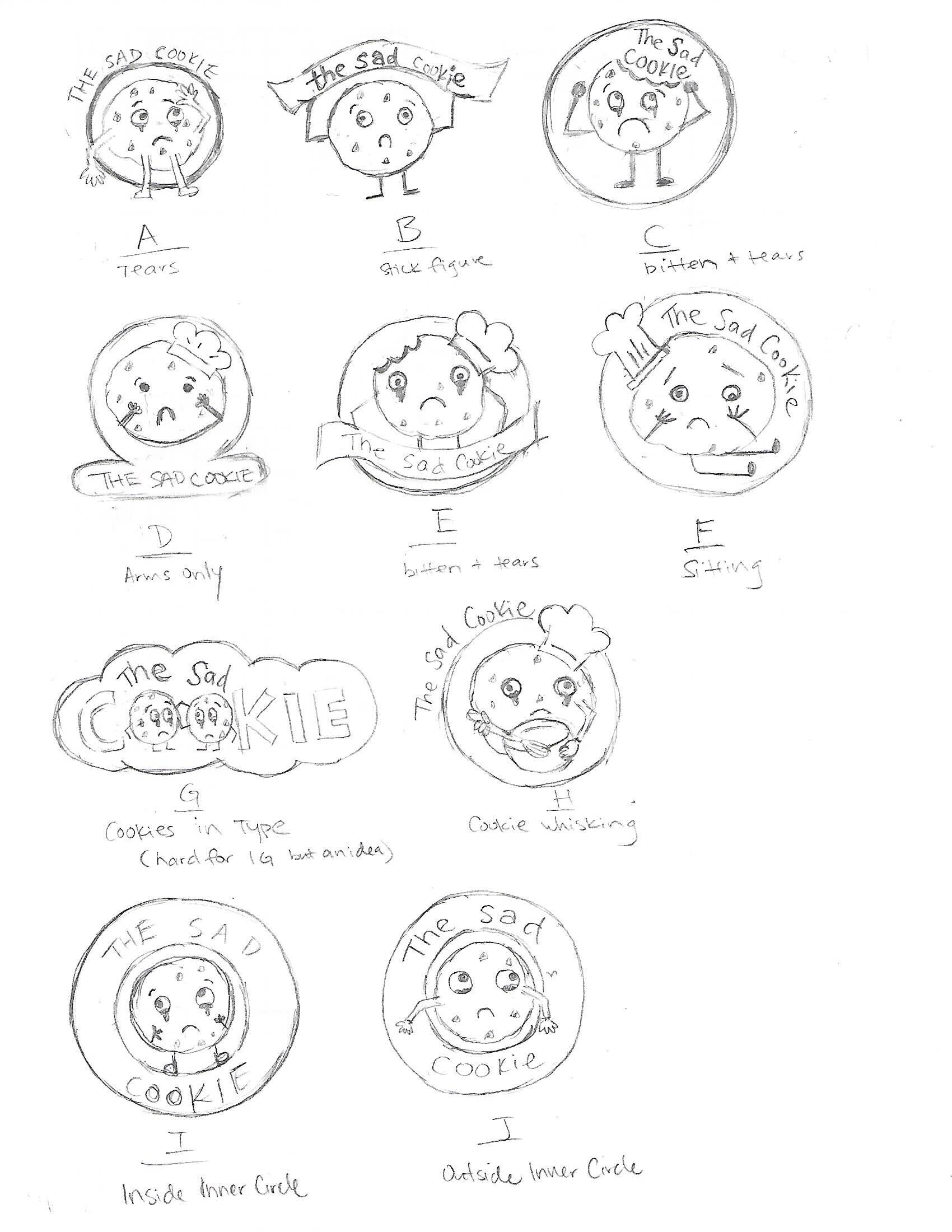
With the first round of sketches shown to the client, he was able to narrow down on which one he likes more and I was able to create a 2nd round of sketches based on his feedback and comments.

DIGITIZE
Next, I scanned in my sketches to be digitized - starting solely with black and white.
Afterwards, I began to add in color and explored with strokes and different fonts. I picked 3 background colors for my client to decide: Yellow - a “happy” color to contrast with the sadness, Blue - a “sad” color to emphasize on the sadness, and Mint Green - to complement “mint chocolate chip”.